I’ve written extensively about 5-star rating systems and their flaws, so where are my alternative solutions? Right here: a 2D grid, two axes, not just one. ‘Head’: the quality of the media, how much you respect it and recognise its craftsmanship; and ‘Heart’: how much you personally enjoyed it, regardless of society’s view on it.
This is Part 3 of a 3-part post: Part 1 - Part 2.
Welcome to Head and Heart.
In Part 2, I theorised that a 1-3 scale was perfect. 1 for bad, 2 for okay, 3 for great.
As soon as I started using it, I realised I had made a mistake. 1-3 is too vague. If I rate Interstellar a 3 on Head, where do I put The Menu? I liked it a lot, I thought it was excellently made. Is it also a 3? Probably. But is it the same 3? Is it as good? I don’t think so. I don’t want to give it a 2, because then I’m equating it with worse films, and then I fell into the same pattern again.
So, I decided to expand the grid to 5x5. It gives just enough precision so you can differentiate “Good” from “Masterpiece” without falling back into the trap of “Is this a 72 or a 73 out of 100?” (which I did a lot when I used my original system on favourites.me.)
Quick pivot to 6x6
After a couple of weeks using the site, I progressed from 5x5 to 6x6. There was a very clear reason for this - not having 0 as an option on a 5x5 scale means you create mathematical bias. The middle is suddenly 3, not 2.5. I fixed this quickly by adding a 0 on both scales.
A beneficial side-effect of this is it removes the ‘safe middle’ - you now have to make a slight conscious choice to put your rating on the side of ‘recommend’ or ‘not recommend’ - a good mental push in my view.
Visualising the Data
This is the part I’m most excited about. The whole point of tracking this data isn’t just to have a list; it’s to see trends.
There’s a statistics page with rating histograms, a summary of your monthly activity, and a comparison of your average ratings compared to society’s (using TMDB and OpenLibrary APIs!)
There’s a scatter plot with a line of agreement at head=heart. Above the line lives media that I enjoyed more than I know I should have (guilty pleasures). Below the line lives media that I respect intellectually, but just couldn’t get behind (like Schindler’s List).
This means I can create a heatmap (something I’d wanted to visualise for a while) very easily, something that simply wouldn’t look good at all on a 3x3 grid.
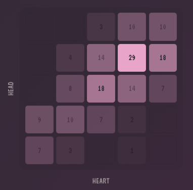 The Head and Heart Heatmap
What about the CSVs?
I promised I wouldn’t lock data away, and I stick to that. You own your data, and you can export, modify, and re-import freely, without any restrictions.
Final Thoughts
The transition from a spreadsheet to a full application has been exciting. I stopped using favourites.me because I had too much choice paralysis on a 100-point scale, but I didn’t want to go back to Letterboxd’s 10-point scale - so here is my new, all-improved, 36-point scale.
The two-axis system feels right to me. It frees me from the pressure of “objective” reviews and lets me admit that sometimes, I just really love a terrible movie (like Click with Adam Sandler), and that’s okay.
The new version is live now. Go track some stuff!